What Is Analogous Colour Scheme? A Simple Guide for Beginners
When it comes to creating visually appealing designs, understanding colour theory is essential. One of the most harmonious and naturally pleasing colour combinations in design is the analogous colour scheme. But what is analogous colour scheme, and how can you use it effectively in your projects?
Whether you’re a beginner in graphic design, interior decorating, painting, or simply someone interested in the world of colours, this guide will walk you through everything you need to know about analogous colour schemes — what they are, how they work, and tips to make the most of them.
What Is Analogous Colour Scheme?
An analogous colour scheme refers to a group of colours that are next to each other on the colour wheel. These colours usually share a common base hue and create a serene, cohesive, and visually pleasing look.
For example, red, red-orange, and orange form an analogous colour scheme. So do blue, blue-green, and green.
The key idea is harmony. Since these colours are closely related, they blend effortlessly and don’t create jarring contrasts. This makes analogous colour schemes ideal for creating a smooth, unified look in any design or artwork.
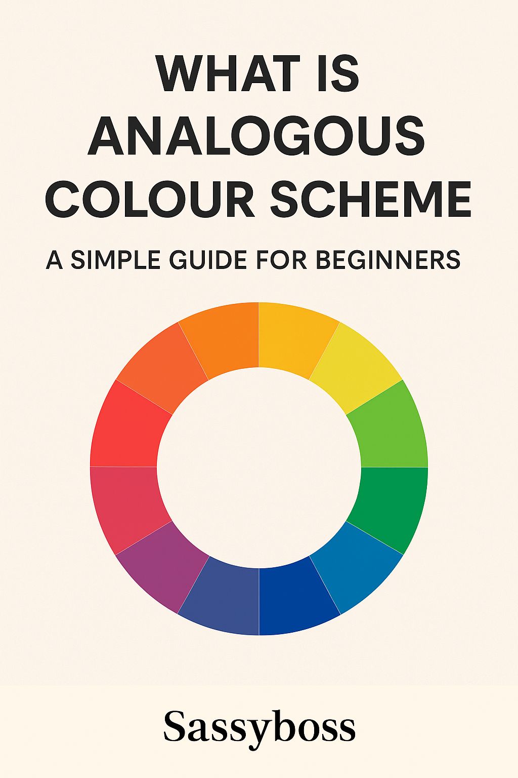
Understanding the Colour Wheel
To fully understand what an analogous colour scheme is, let’s take a quick look at the colour wheel.
The colour wheel consists of:
• Primary colours: Red, blue, and yellow
• Secondary colours: Green, orange, and purple (created by mixing primary colours)
• Tertiary colours: Made by mixing a primary and a secondary colour (e.g., red-orange, blue-green)
When you pick any colour on the wheel and look at the colours directly beside it (usually 2–4 hues), you’ve found an analogous colour palette. The most common combination includes three colours:
• The main colour (dominant)
• The supporting colour (accent)
• The third colour (a highlight or background tone)
Examples of Analogous Colour Schemes
Here are a few classic examples of analogous colour combinations:
• Blue, Blue-Green, Green – Cool and calming
• Red, Red-Orange, Orange – Warm and energetic
• Yellow, Yellow-Green, Green – Fresh and vibrant
• Purple, Red-Purple, Red – Rich and romantic
Each group evokes a different mood or feeling, depending on the hues and saturation levels.
Why Use Analogous Colour Schemes?
There are several reasons why designers and artists choose analogous colour schemes:
1. Harmony and Cohesion
These colour combinations naturally look good together. Since the hues are closely related, they create a sense of unity and flow.
2. Emotional Impact
Colours affect how people feel. Analogous colour schemes can be used to enhance the mood of a design — warm tones for excitement and energy, cool tones for calm and relaxation.
3. Versatility
From websites to branding, fashion, interior design, and art — analogous colour schemes are incredibly versatile and easy to adapt across different media.
4. Beginner-Friendly
If you’re just starting out in colour theory, analogous colour schemes are a safe and effective way to begin experimenting with colour without the risk of clashing combinations.
How to Create an Analogous Colour Scheme
Here’s a simple step-by-step method for creating your own analogous palette:
Step 1: Pick a Base Colour
Choose a dominant colour that fits the mood or message of your design.
Step 2: Choose 2–3 Adjacent Colours
Look at the colour wheel and pick 1–2 colours next to your base colour. These should be within the same colour family but distinct enough to create visual interest.
Step 3: Decide on Proportions
Use the 60-30-10 rule:
• 60% dominant colour
• 30% supporting colour
• 10% accent colour
This helps maintain balance and avoids overwhelming the viewer.
Step 4: Adjust Saturation and Brightness
Play with shades (darker versions), tints (lighter versions), and tones (muted versions) to add depth and contrast without leaving the analogous range.
When to Use Analogous Colour Schemes
These colour schemes work best in the following scenarios:
• Branding: To convey a consistent visual identity
• Interior Design: For relaxing, unified spaces (e.g., blue-green bathrooms or warm orange-red living rooms)
• Web Design: When you want an elegant, non-distracting UI
• Art and Illustration: To guide the viewer’s eye smoothly across a composition
• Photography and Film: For mood setting (e.g., Wes Anderson often uses tight, harmonious palettes)
Tips for Using Analogous Colours Effectively
1. Create Contrast with Value or Texture
Since the hues are similar, vary their lightness/darkness or use different textures to create visual separation.
2. Add Neutrals
Incorporating white, grey, or black can help balance the scheme and prevent it from becoming too intense.
3. Watch for Over-Saturation
Too many bright hues in the same family can be overwhelming. Use muted tones or softer shades when needed.
4. Use a Colour Picker Tool
Online tools like Adobe Color or Coolors can help you generate and visualize analogous palettes easily.
5. Test in Real Contexts
Always preview your colour scheme in the context it’s intended for — on a website, print, or physical space — to see how it really looks.
Common Mistakes to Avoid
• Using too many hues: Stick to 3-4 adjacent colours to avoid visual clutter.
• Lack of contrast: When colours are too similar, your design may look flat. Use value and intensity to create separation.
• Ignoring emotional tone: Make sure your colours match the feeling or brand you’re trying to express.
Conclusion: The Power of Analogous Colours
So, what is analogous colour scheme all about? In essence, it’s a simple yet powerful tool in any designer’s toolkit. By using colours that naturally go together, you can create visually appealing, emotionally resonant designs that feel cohesive and well thought out.
Whether you’re a beginner just learning the ropes of colour theory or a seasoned creator looking for a reliable colour strategy, the analogous colour scheme offers a beautiful balance of simplicity and sophistication.
Now that you know the basics, give it a try in your next design project — and watch your work come to life with harmonious hues!
Have you used an analogous colour scheme in your own work? Share your experience or tips in the comments below!